
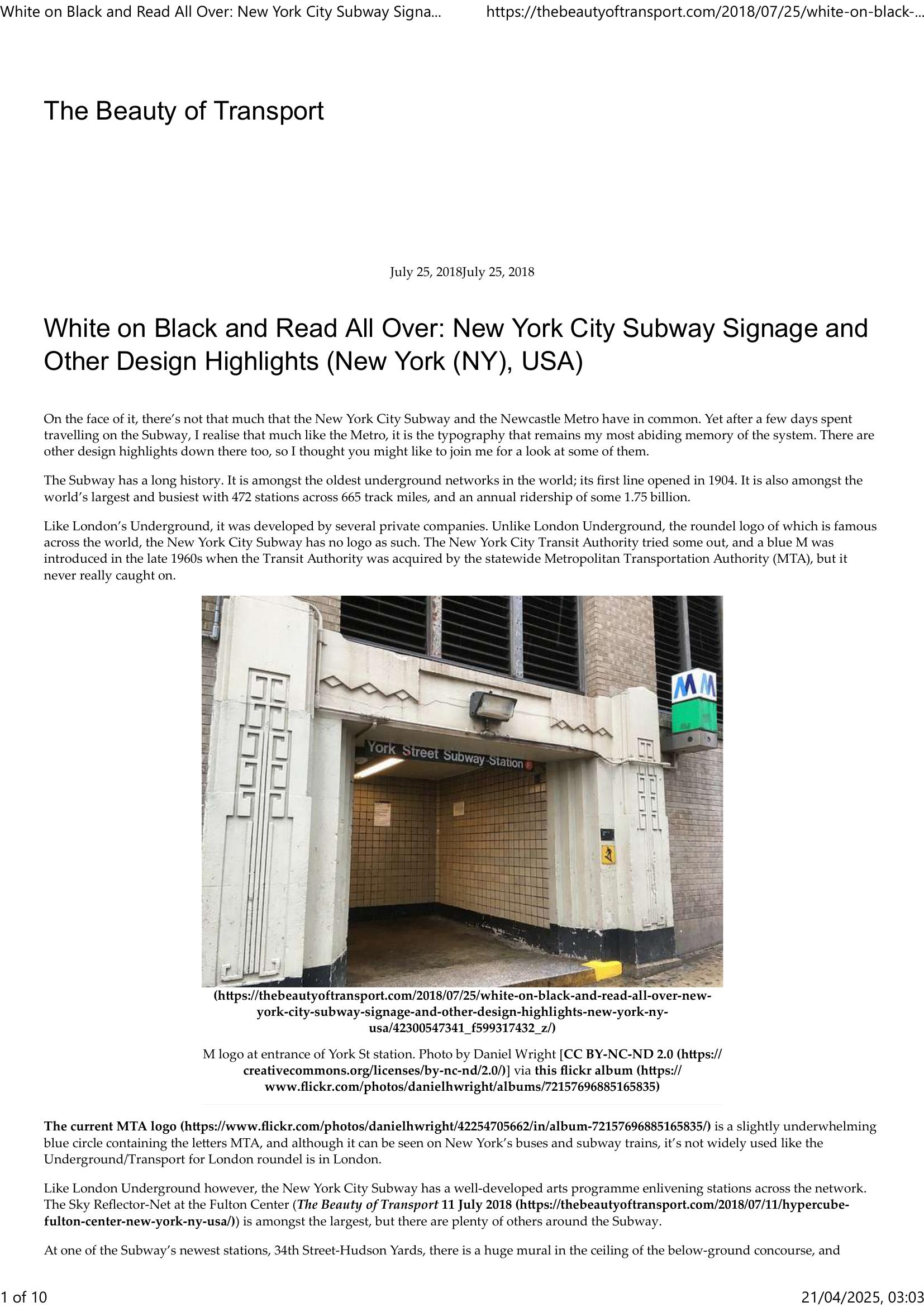
Wright – THE BEAUTY OF TRANSPORT – WHITE ON BLACK AND READ ALL OVER 2018
£0.00
A downloadable PDF file for your personal use.
Description
The author finds typography—particularly the Subway’s white-on-black signage and Helvetica typeface—to be the most memorable element of the New York City Subway. Despite being one of the world’s oldest, largest and busiest systems (first line 1904; 472 stations), it lacks a bold transit logo; the MTA emblem is understated. The network mixes rich station art (Fulton Center’s Sky Reflector‑Net, Hudson Yards murals, Whitehall’s fence artwork) and heritage mosaic tiling with a famously chaotic operational layout: long, noisy trains, confusing express/local patterns, and a spaghettified map that replaced the cleaner Vignelli design. Design efforts by Unimark in the 1960s accidentally created the Subway’s distinctive black signage stripe; a 1970s color reversal and a 1989 standards manual made Helvetica the official font. Today, large white text on black with vivid colored line icons is both highly functional—making sparse entrances visible—and culturally iconic, appearing on transit merchandise and shaping New York’s visual identity.
Additional information
| Pages | 10 |
|---|---|
| Filesize | 0.8Mb |
Related products
-
Attoma, Dubuc and Boyer-Moraes – MAPS BY ATTOMA 2014
£0.00 Add to basket -

American Public Transit Association – TIMETABLES 1982
£0.00 Add to basket -

Association of Train Operating Companies Passenger Information Strategy Group – GOOD PRACTICE GUIDES FOR PROVIDING INFORMATION TO PASSENGERS 2008
£0.00 Add to basket -
Association of Transport Co-ordinating Officers – PRINTED PUBLIC TRANSPORT INFORMATION 2001
£0.00 Add to basket