
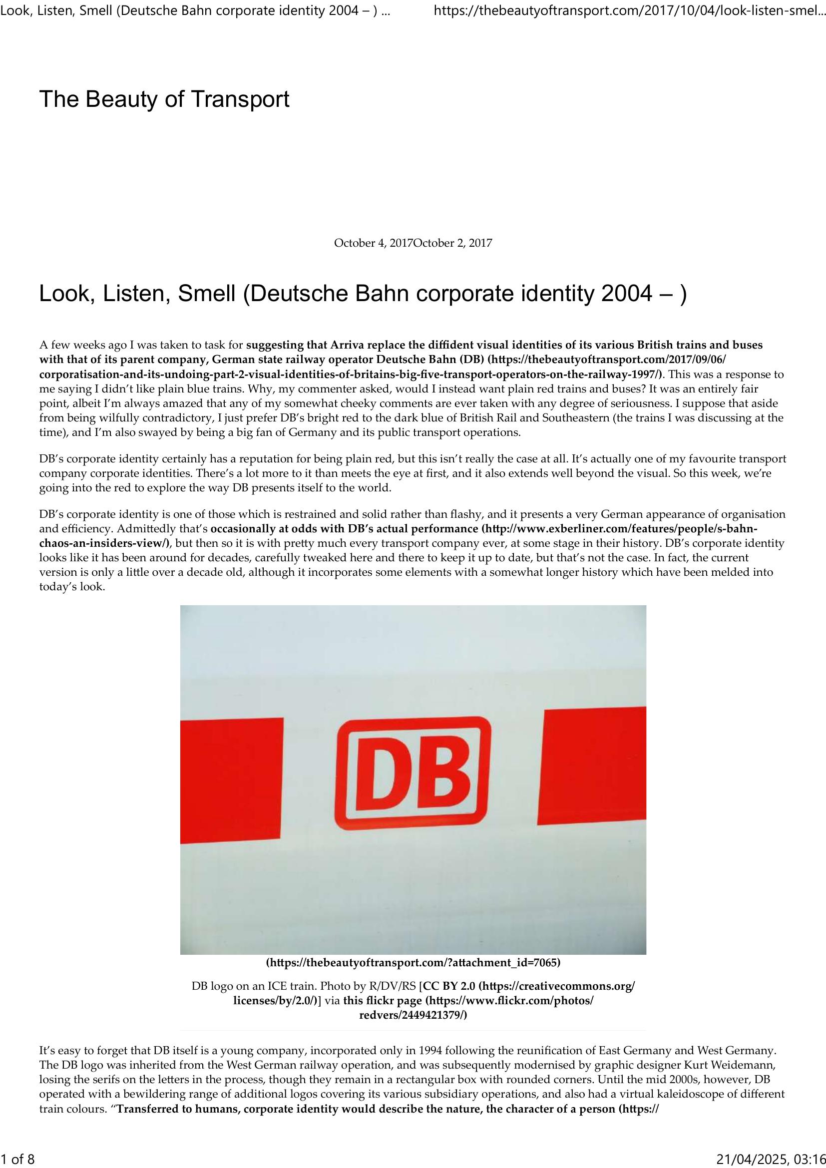
Wright – THE BEAUTY OF TRANSPORT – LOOK, LISTEN, SMELL 2017
£0.00
A downloadable PDF file for your personal use.
Description
The author defends their preference for Deutsche Bahn’s (DB) corporate identity, arguing it is far more than “plain red.” Created after DB’s 1994 formation and modernized in the mid-2000s, the identity consolidated many subsidiary logos and color schemes into a coherent system centered on bespoke typefaces by Christian Schwarz and Erik Spiekermann. The redesign standardized signage, templates, pictograms and timetables, and simplified train liveries: pale grey/white with red highlights for long-distance (ICE/IC), red variants for regional (Regio), blue for freight and grey for network/maintenance. Interiors (notably ICE) follow rigorous specifications, while buses, bikes and car‑share vehicles extend the identity across mobility services. DB’s branding is multisensory—featuring sonic logos and even station scents—and continues to evolve with improved wayfinding and exterior markings. Though regional operators introduce variation, DB’s visual system remains comprehensive, meticulous and adaptable, projecting organisational efficiency rather than mere monochrome branding.
Additional information
| Pages | 8 |
|---|---|
| Filesize | 0.8Mb |
Related products
-
Annear – A TWIST ON THE MBTAS MAP DESIGN 2014
£0.00 Add to basket -
Allsop – DETERMINING WHICH REQUIREMENTS OF PUBLIC TRANSPORT USERS IN LARGE CITIES COULD BE MET BY MODERN INFORMATION TECHNOLOGY 1987
£0.00 Add to basket -
Accent Marketing & Research – BUS STATION INFORMATION 1998
£0.00 Add to basket -
Anon – ONE-DIMENSIONAL TIMETABLES 1993
£0.00 Add to basket