
Glantz – THE WORLDS BEST DESIGNED METRO MAPS 2025
£0.00
A downloadable PDF file for your personal use.
Description
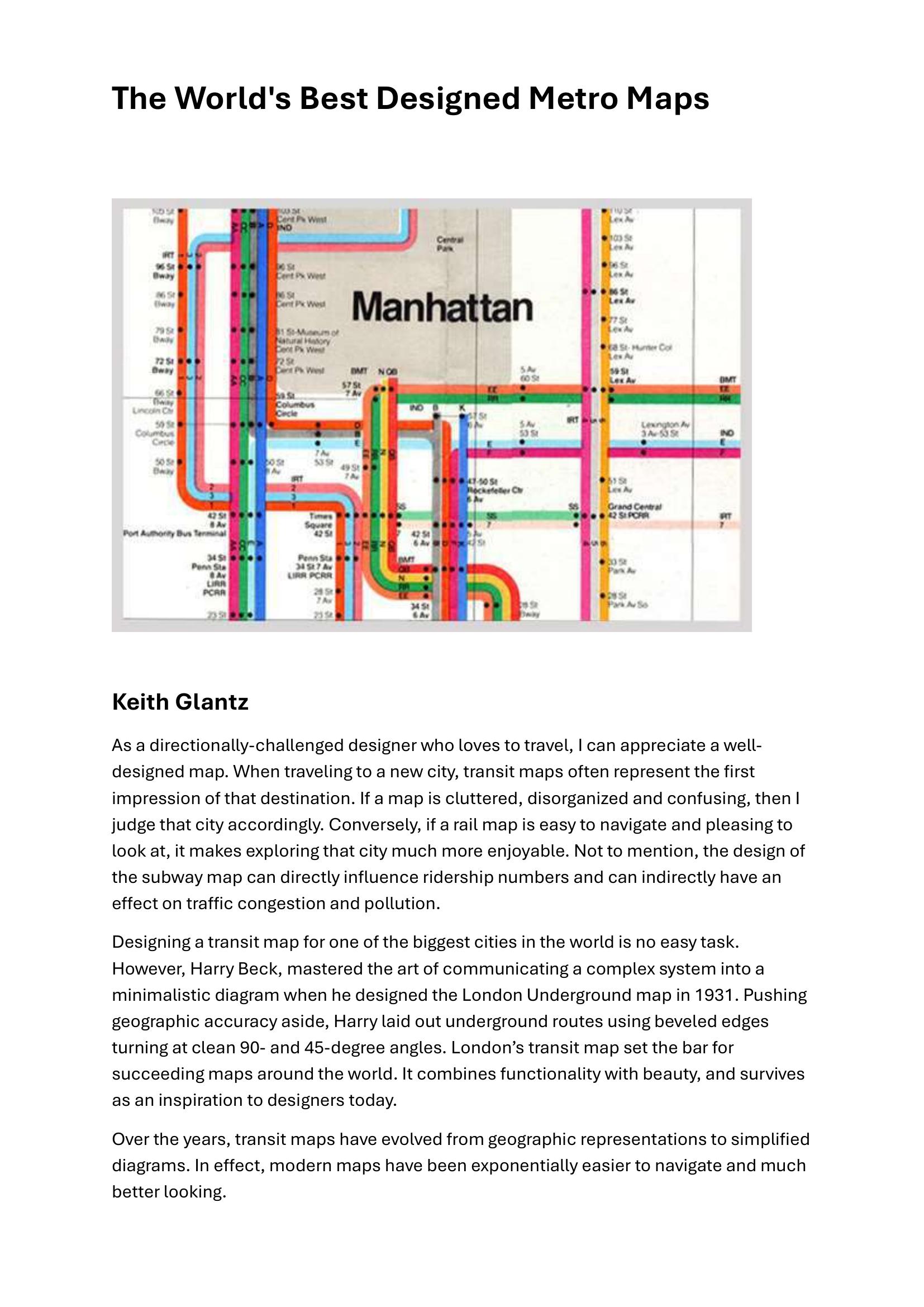
Designer Keith Glantz argues that well-crafted transit maps shape travelers’ first impressions, influence ridership, and can affect traffic and pollution. He credits Harry Beck’s 1931 London Underground map for establishing the schematic prototype—prioritizing clarity over geographic accuracy with clean 90°/45° angles and a minimal aesthetic—that transformed modern transit mapping. Glantz surveys exemplary systems: Madrid (soft palette, thin lines, ample whitespace); Washington, D.C. (bold colored lines, clear transfers, tourist-friendly icons); Bangkok (pleasing, plaid-like overlay with transparent rivers); Montreal (effective black background); Paris (elegant); Amsterdam (balance of topography and geometry); and Lisbon (flowing, storylike design with characterful icons). Moscow’s map centers the city around its circular line using prominent station markers and white space. New York’s map is criticized as cluttered; Vignelli’s simplified 1970s diagram was replaced for obscuring geography, and many designers have since proposed reinterpretations. Chicago’s map is judged functional and clear but visually uninspired.
Additional information
| Pages | 10 |
|---|---|
| Filesize | 0.6Mb |
Related products
-
Anon – ONLY CONNECT 1987
£0.00 Add to basket -
Association of Transport Co-ordinating Officers – PRINTED PUBLIC TRANSPORT INFORMATION 2001
£0.00 Add to basket -
Association of Public Transport Co-ordination Officers – PUBLIC TRANSPORT INFORMATION 1982
£0.00 Add to basket -
Association of Train Operating Companies – PRESENTATION OF TIMETABLE INFORMATION 1997
£0.00 Add to basket