Wright – THE BEAUTY OF TRANSPORT – ON LINE TYPEFACE 2015
£0.00
A downloadable PDF file for your personal use.
Description
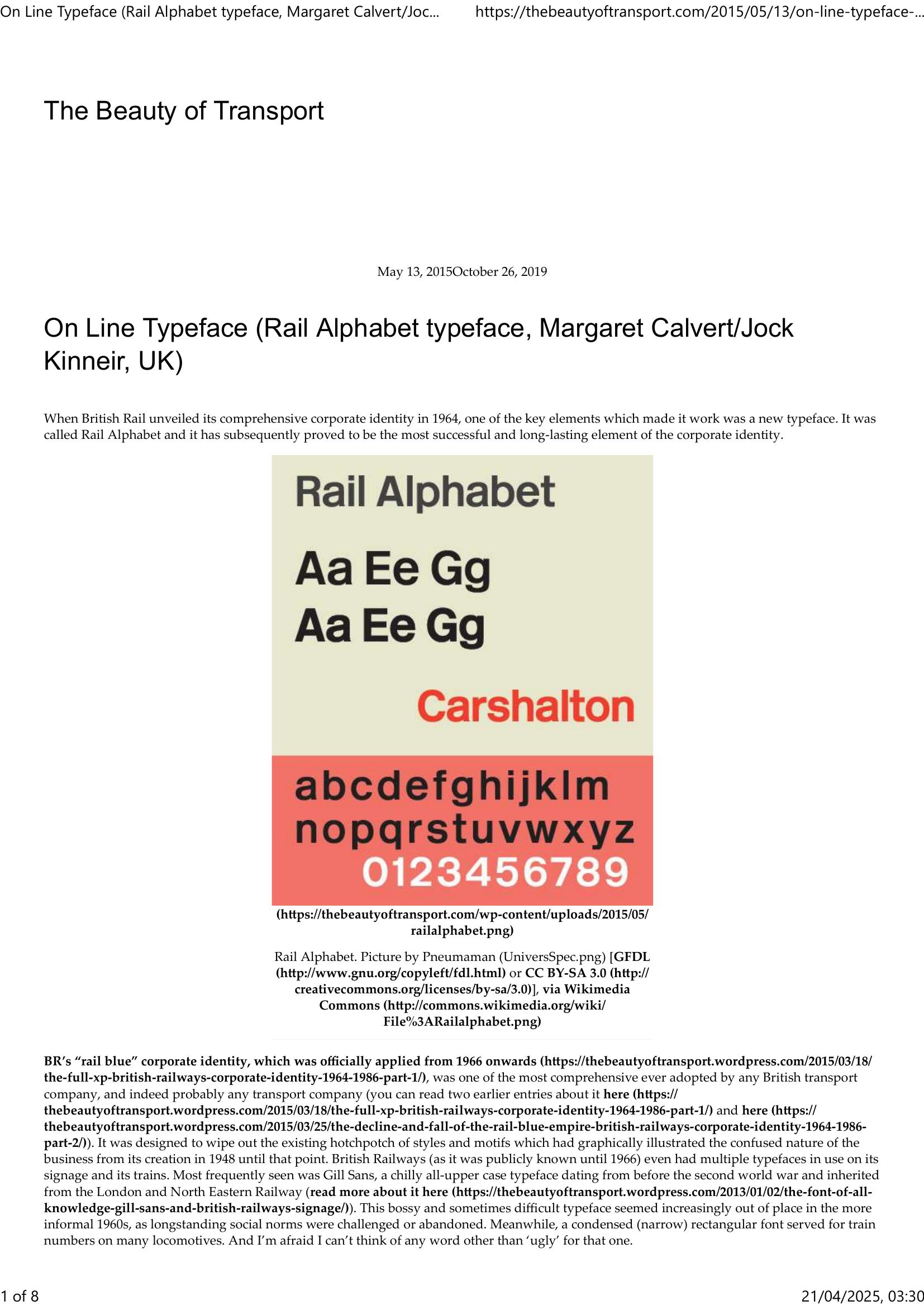
Rail Alphabet, designed by Margaret Calvert and Jock Kinneir for British Rail’s 1964 corporate identity, became the defining and longest-lived element of the company’s visual system. Created to replace a mixed, outdated signage palette (notably Gill Sans and narrow locomotive lettering), Rail Alphabet is a mixed‑case, low‑key, highly legible typeface with slightly heavier, tighter letterforms than the road-focused Transport typeface and some visual kinship to Helvetica. It was deployed across stations, trains, vehicles, timetables, departure boards and pictograms, and even spread to airports and hospitals, helping to standardize wayfinding in large public institutions. Documented in BR’s Corporate Identity Manual and later digitised, it survived the fragmentation of rail branding after privatisation and remains mandated for many operational notices and data panels, though other typefaces (e.g. Brunel, Frutiger) have been adopted by different operators. Its restrained design gave it lasting usefulness and a timeless quality, even as Britain’s wider rail identity evolved and diversified.
Additional information
| Pages | 8 |
|---|---|
| Filesize | 0.5Mb |
Related products
-
Association of Train Operating Companies – PASSENGER INFORMATION DURING DISRUPTION 2014
£0.00 Add to basket -
Attoma – MAPPING MOBILITY 2024
£0.00 Add to basket -
Allard – THE DESIGN OF PUBLIC TRANSPORT MAPS 2009
£0.00 Add to basket -
Association of Transport Co-ordinating Officers – PRINTED INFORMATION AT BUS STOPS 2004
£0.00 Add to basket