
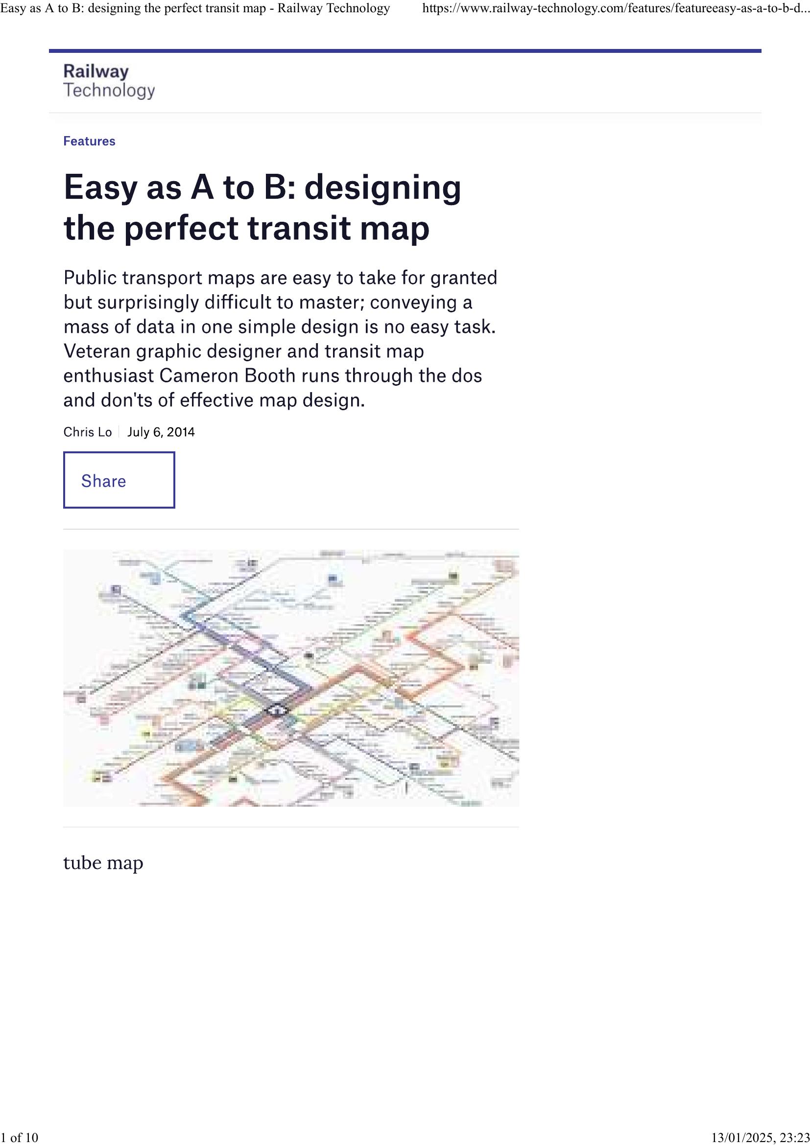
Booth – EASY AS A TO B 2014
£0.00
A downloadable PDF file for your personal use.
Description
Transit maps are vital to public transport perception and usability, yet designing them is complex. Veteran designer Cameron Booth emphasizes a clear information hierarchy: prominent interchanges, clearly marked termini, prioritized modes, and increasingly, service frequency. Maps must be immediately intuitive—minimizing legend reliance and using familiar symbols—because users glance briefly. Common pitfalls include inappropriate geographical maps, raw GIS exports, and poorly conceived diagrammatic maps that lack rhythm, consistent spacing, and traceable routes. While the 45-degree diagram is widespread, designers should adapt styles to each network; European maps tend to be cleaner and more diagrammatic, U.S. maps more varied and often geography-driven. Geographic maps work well for buses. Digital tools enable real-time updates, time-dependent maps, and zoom-based detail, but mobile apps must be designed for their platform rather than copying paper maps. Well-designed, attractive maps can boost ridership by projecting simplicity and confidence. Booth praises Stuttgart’s isometric map as a model and advocates greater use of frequency and interactive digital mapping.
Additional information
| Pages | 10 |
|---|---|
| Filesize | 3.5Mb |
Related products
-
Association of Train Operating Companies – PROVISION OF CUSTOMER INFORMATION 2016
£0.00 Add to basket -
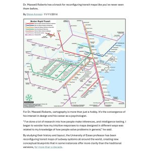
Annear – A TWIST ON THE MBTAS MAP DESIGN 2014
£0.00 Add to basket -
Anceresi, Gatti, Vecchi, Marelli and Rinaldi – A MAP OF WORDS 2023
£0.00 Add to basket -
Attoma – MAPPING MOBILITY 2024
£0.00 Add to basket