Harrison – 100 YEARS OF JOHNSTON 2018
£0.00
A downloadable PDF file for your personal use.
Description
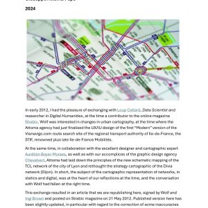
The document chronicles the Johnston typeface’s 100-year role in shaping London’s visual identity since its 1916 debut by Edward Johnston. Commissioned to give the Underground a clear, distinctive look, Johnston drew on Roman Trajan and square capitals to create a humanist, understated design that blends tradition with modernity and functions unobtrusively across the city. Early network innovations—such as the 1908 roundel and the word “Underground,” driven by figures like Albert Stanley and Frank Pick—established the need for a unified typographic voice. Influences on urban mapping and design include Phyllis Pearsall’s A–Z maps and John Snow’s cholera map. In 1979 Colin Banks and John Miles refined Johnston by moderating stroke ratios to meet contemporary needs, and Monotype later adapted it for digital use with thinner weights and restored idiosyncrasies to preserve character. Beyond signage, Johnston carries cultural and political significance as a symbol of London’s history and identity. The article also offers images, references, and links for further exploration.
Additional information
| Pages | 8 |
|---|---|
| Filesize | 1.9Mb |