
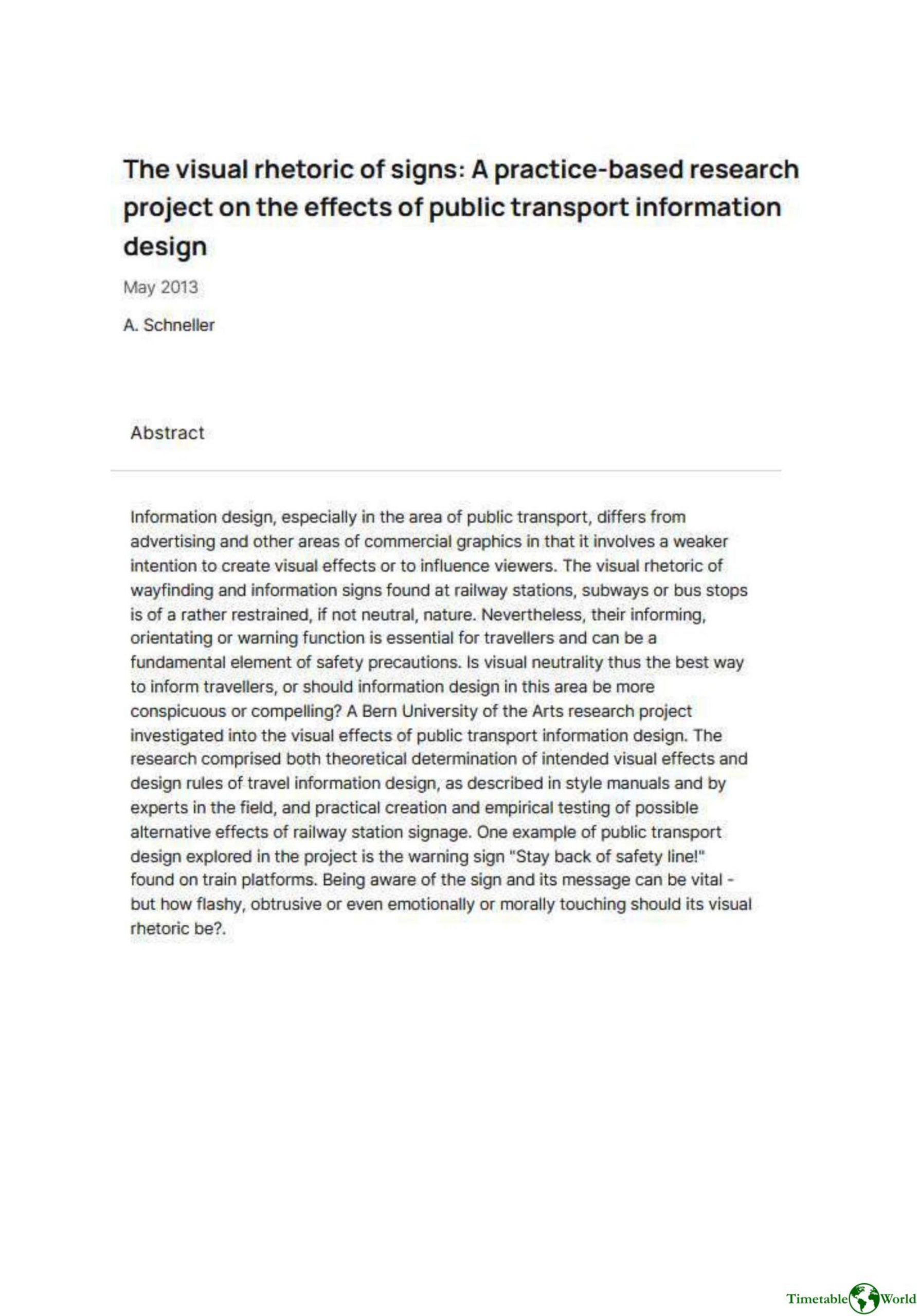
Schneller – THE VISUAL RHETORIC OF SIGNS 2013
£0.00
A downloadable PDF file for your personal use. Timetable World has applied OCR to make the text searchable, and each page carries a small Timetable World logo.
Description
This practice-based research project by A. Schneller (May 2013) examines the visual rhetoric of public transport information design, arguing that it differs from commercial graphic design by generally avoiding strong visual effects or persuasion. Wayfinding and informational signs at stations, subways, and stops often strive for visual neutrality, yet their functions—informing, orienting, and warning—are critical to traveler safety. The study asks whether visual neutrality is optimal or whether information design should be more conspicuous, compelling, or emotionally engaging to improve comprehension and compliance. Conducted at Bern University of the Arts, the research combined theoretical analysis of intended visual effects and design rules drawn from style manuals and expert opinion with practical creation and empirical testing of alternative railway station signs. One focal example is the warning “Stay back of safety line” on platforms: while awareness of this message is vital, the project interrogates how flashy, obtrusive, or emotionally charged such signage should be to enhance effectiveness.
Additional information
| Pages | 1 |
|---|---|
| Filesize | 0.2Mb |
Related products
-
Anon – ONLY CONNECT 1987
£0.00 Add to basket -
Association of Public Transport Co-ordination Officers – PUBLIC TRANSPORT INFORMATION 1982
£0.00 Add to basket -
Accent Marketing & Research – MAPS AND TIMETABLES AT BUS STOPS 1999
£0.00 Add to basket -

American Public Transit Association – TIMETABLES 1982
£0.00 Add to basket