Booth – TRANSIT MAPS 2010 2010
£0.00
A downloadable PDF file for your personal use.
Description
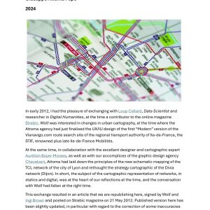
Transit Maps is a blog by designer Cameron Booth that examines and reimagines transit diagrams worldwide. Booth emphasizes clarity and accuracy, reviewing maps and creating his own transit-styled diagrams. His Washington, DC Metro redesign critiques the official map’s amateurish execution—uneven line keylines, miscentered station dots, poor parking symbols, inconsistent type angles, distorted district borders and confusing callouts—and highlights inaccuracies in station placement. His redesign preserves the district diamond and sheet size, uses thinner lines to accommodate the Silver Line and commuter rail, depicts line interactions (e.g., Red running under others), labels lines with single-letter identifiers, shows peak-hour restrictions via darker center lines, sets all station names horizontally, and improves color, border and legend hierarchy for legibility. Booth also produced a full Amtrak subway-style map (regularly updated) showing every station, and a detailed subway-style diagram of Europe’s E‑Road network, adopting a more precise style to handle its complexity and noting caveats about ferry routes and numbering anomalies.
Additional information
| Pages | 8 |
|---|---|
| Filesize | 0.4Mb |