
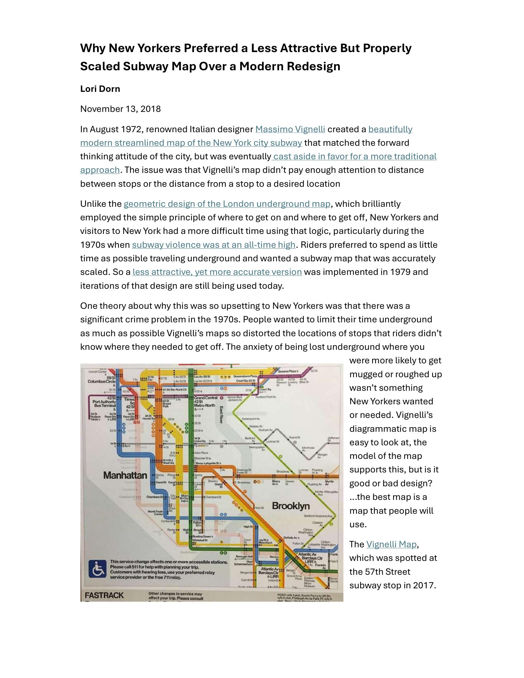
Dorn – WHY NEW YORKERS PREFERRED A LESS ATTRACTIVE BUT PROPERLY SCALED SUBWAY MAP OVER A MODERN REDESIGN 2018
£0.00
A downloadable PDF file for your personal use.
Description
In 1972 Italian designer Massimo Vignelli produced a modern, geometric redesign of the New York City subway map celebrated for its aesthetics but criticized for ignoring geographic scale and actual distances between stops. Unlike London’s schematic map—useful for knowing where to board and exit—Vignelli’s diagram distorted station locations, which frustrated riders during the 1970s when high subway crime made minimizing time underground a priority. Because passengers needed an accurately scaled map to avoid getting lost or spending extra time belowground, the transit authority adopted a less visually elegant but geographically faithful map in 1979; its derivatives remain in use. Designers have since tried to reconcile Vignelli’s clarity with practical scale—Tommi Moilanen’s 2015 concept is one example—and Vignelli himself proposed a to-scale 2008 update that wasn’t implemented. The episode underscores that effective transit design must reflect a city’s specific context and, above all, be usable.
Additional information
| Pages | 3 |
|---|---|
| Filesize | 0.2Mb |
Related products
-
Association of Transport Co-ordinating Officers – PRINTED PUBLIC TRANSPORT INFORMATION 2003
£0.00 Add to basket -

Association of Train Operating Companies – HOW TO PRESENT TIMETABLE INFORMATION 2005
£0.00 Add to basket -
Association of Train Operating Companies – PASSENGER INFORMATION DURING DISRUPTION 2014
£0.00 Add to basket -
Attoma, Dubuc and Boyer-Moraes – MAPS BY ATTOMA 2014
£0.00 Add to basket