
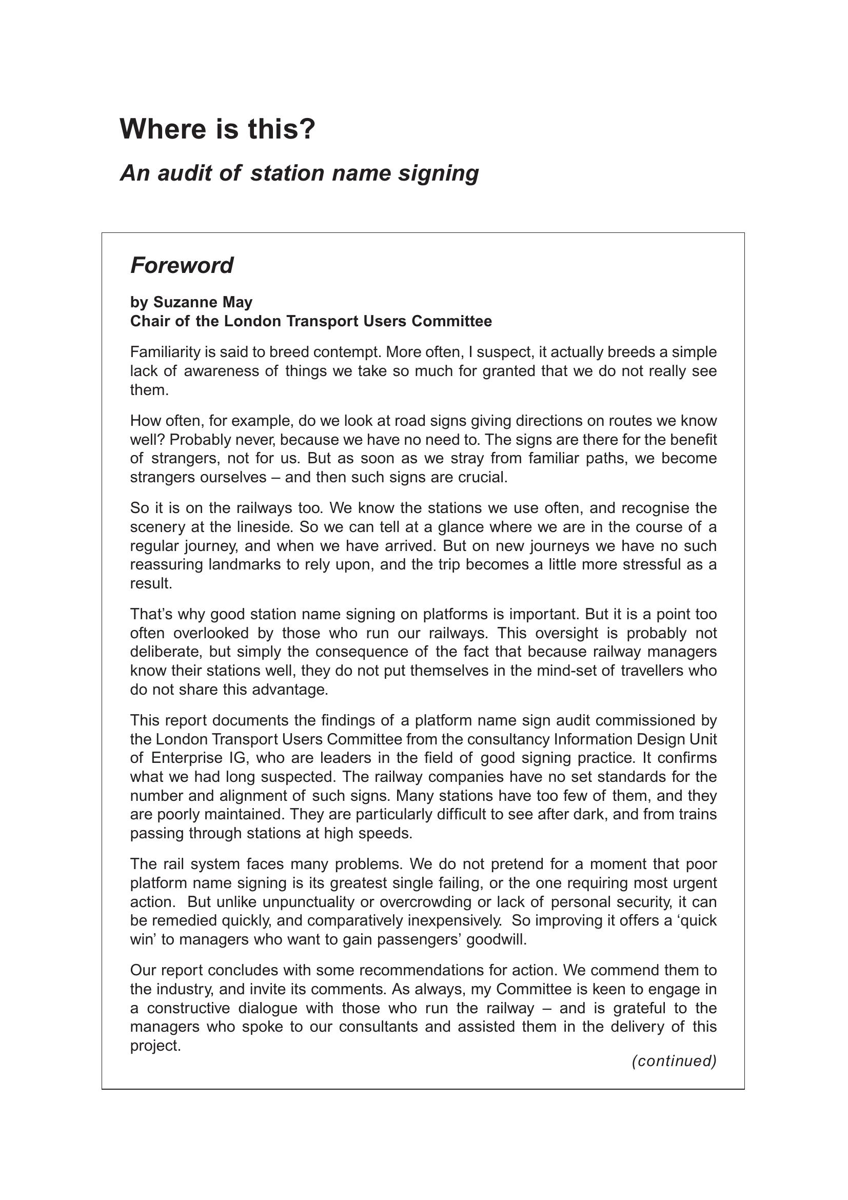
London Transport Users Committee – WHERE IS THIS 2004
£0.00
A downloadable PDF file for your personal use.
Description
The Information Design Unit audited National Rail station name signs across London to assess visibility, legibility and illumination from trains, using document review, operator consultation, platform and train audits, and passenger needs assessment. It found no consistent industry standard: operator rebranding often prioritises branding over functionality, while London Underground guidance is more prescriptive. Most signs are readable in daylight from about 6–7 m but are frequently poorly lit at night, mounted too high (commonly ~2.1 m+), spaced too far apart (often 20–30 m), and obscured by window dividers, seat backs, reflections, adjacent trains, vandalism and faded text. Typefaces are generally acceptable but letter heights vary and dark signs lack adequate illumination; few signs are internally lit. On-board aids are inconsistent and cannot substitute clear platform signing. The report recommends standardised specifications—size, height, frequency, placement, colour, reflectivity and illumination—enforced by Network Rail/SRA, with measures such as ≤10 m spacing (ideally 5 m), varied mounting heights (2100 mm and some 1400 mm), large illuminated run-in signs, improved lighting, double-sided signs and anti-graffiti finishes.
Additional information
| Pages | 32 |
|---|---|
| Filesize | 3.9Mb |
Related products
-
Allsop – DETERMINING WHICH REQUIREMENTS OF PUBLIC TRANSPORT USERS IN LARGE CITIES COULD BE MET BY MODERN INFORMATION TECHNOLOGY 1987
£0.00 Add to basket -
Association of Train Operating Companies – PASSENGER INFORMATION DURING DISRUPTION 2014
£0.00 Add to basket -
Anon – ONLY CONNECT 1987
£0.00 Add to basket -
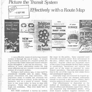
Anon – PICTURE THE TRANSIT SYSTEM EFFECTIVELY WITH A ROUTE MAP 1970
£0.00 Add to basket