
FWT – BUS DESTINATION DISPLAYS FOR TRANSPORT FOR LONDON 2014
£0.00
A downloadable PDF file for your personal use. Timetable World has applied OCR to make the text searchable, and each page carries a small Timetable World logo.
Description
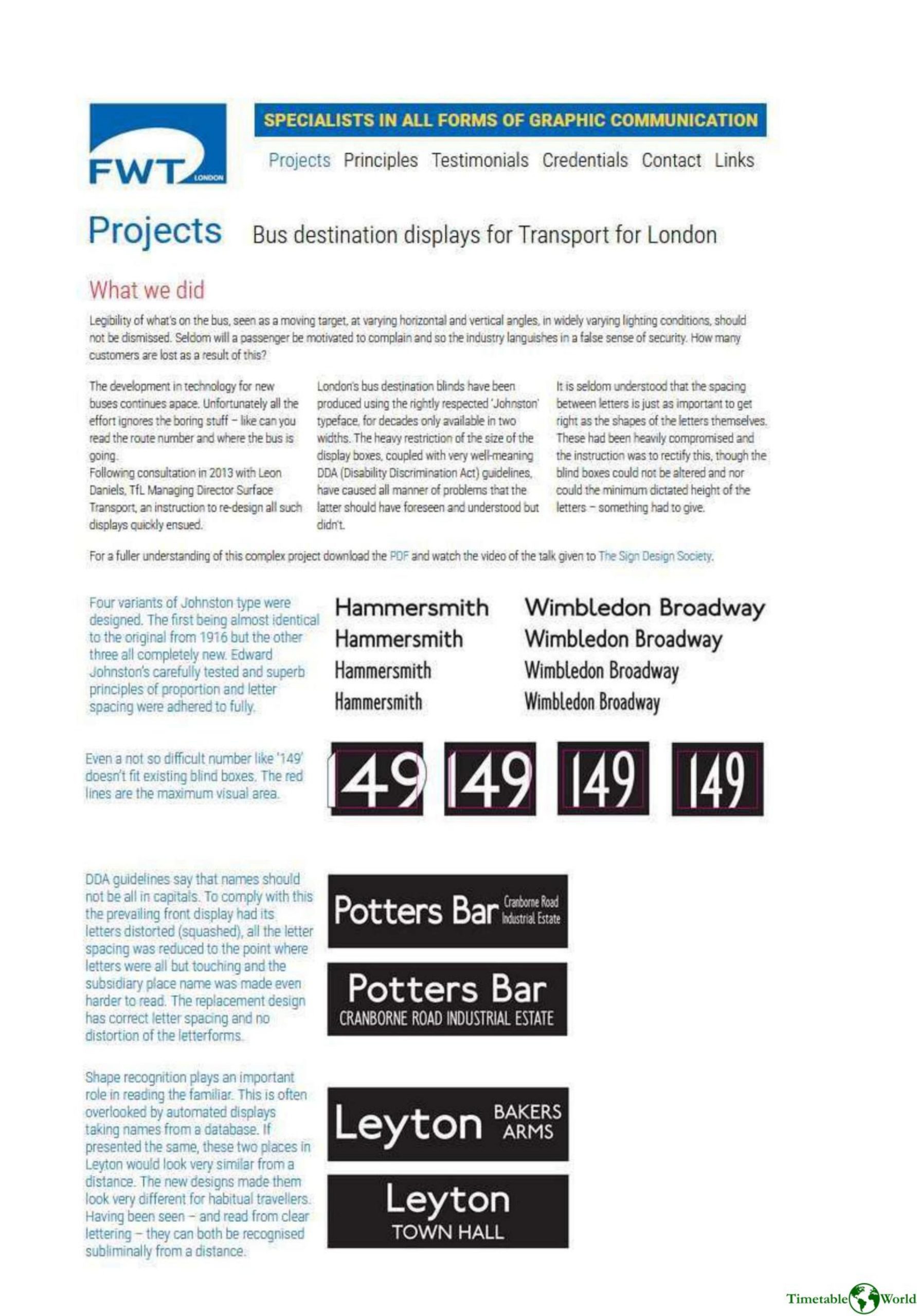
FWT London undertook a TfL brief to redesign London bus destination displays after consultation with Leon Daniels in 2013, addressing widespread legibility failures overlooked by industry trends. Key problems included reading moving targets at varied angles and lighting, restrictive blind-box sizes, and well-meaning DDA guidance that unintentionally forced distorted, squashed lettering and overly tight letter spacing. FWT emphasized that letter spacing is as critical as letter shapes and that automated database presentation can obscure shape recognition important for habitual passengers. They created four Johnston typeface variants—one faithful to the 1916 original and three new designs—restoring correct proportions and spacing while working within existing box and height constraints. Practical changes include standard-width type replacing condensed forms on side displays, clearer multi-line names despite single-line DDA recommendations, and improved distinctiveness for place names and route numbers (e.g., ‘‘149’’). The redesign improves readability, recognition, and passenger guidance; further details are available in a PDF and recorded talk.
Additional information
| Pages | 3 |
|---|---|
| Filesize | 0.5Mb |
Related products
-
Accent Marketing & Research – BUS STATION INFORMATION 1998
£0.00 Add to basket -
Anceresi, Gatti, Vecchi, Marelli and Rinaldi – A MAP OF WORDS 2023
£0.00 Add to basket -

Association of Train Operating Companies – PRESENTATION OF TIMETABLE INFORMATION 1997
£0.00 Add to basket -
Accent Marketing & Research – MAPS AND TIMETABLES AT BUS STOPS 1999
£0.00 Add to basket