
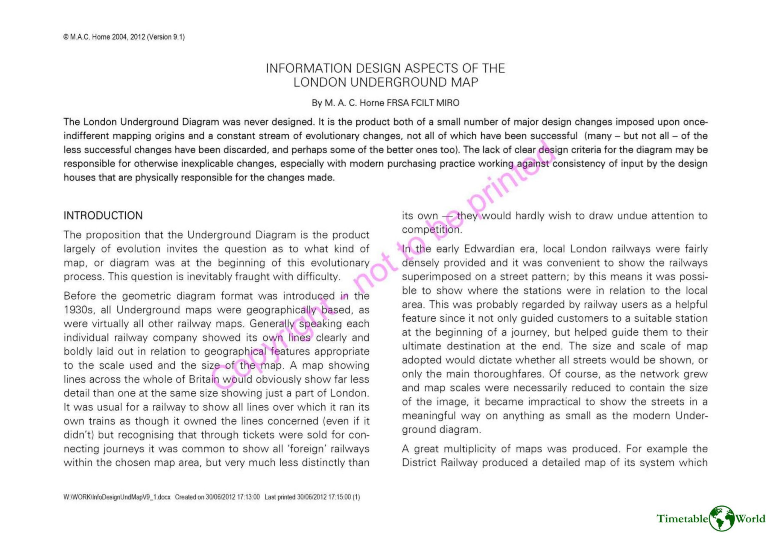
Horne – INFORMATION DESIGN ASPECTS OF THE LONDON UNDERGROUND MAP 2012
£0.00
A downloadable PDF file for your personal use. Timetable World has applied OCR to make the text searchable, and each page carries a small Timetable World logo.
Description
M.A.C. Horne contends the London Underground diagram evolved accidentally through incremental, inconsistent changes rather than from a single design intent. Early maps were geographic and ownership-focused, but joint marketing and colored-line maps (notably a 1907 Evening News map) introduced schematic elements and varied interchange symbols. Tensions between tube-style, end-to-end schematics and the complex Metropolitan/District service patterns, plus prioritizing ownership over passenger information, created legibility problems. Small-format Stingemore maps (1925) and Henry Beck’s 1933 diagram solved many issues by straightening routes and enlarging central London at the expense of geographic and multimodal context. Postwar standardization by 1955 improved consistency, while Hutchison (1959) and Garbutt (1964) refined interchange symbols. Persistent problems remained: multiple independent service sections, inconsistent interchange treatments to accommodate new lines and awkward station layouts, managerial-driven color changes (1990), erratic shuttle/branch depictions, omitted lines, poor monochrome versions, shrinking type and contrast, and misuse of symbols. Overall, creeping inconsistencies now impair passenger comprehension and call for clearer, consistent conventions.
Additional information
| Pages | 25 |
|---|---|
| Filesize | 9.6Mb |
Related products
-
Anceresi, Gatti, Vecchi, Marelli and Rinaldi – A MAP OF WORDS 2023
£0.00 Add to basket -
Association of Transport Co-ordinating Officers – PRINTED PUBLIC TRANSPORT INFORMATION 2003
£0.00 Add to basket -
Association of Transport Co-ordinating Officers – PRINTED INFORMATION AT BUS STOPS 2004
£0.00 Add to basket -
Attoma – MAPPING MOBILITY 2024
£0.00 Add to basket