
Wright – THE BEAUTY OF TRANSPORT – IN SEARCH OF PERFECTION 2021
£0.00
A downloadable PDF file for your personal use.
Description
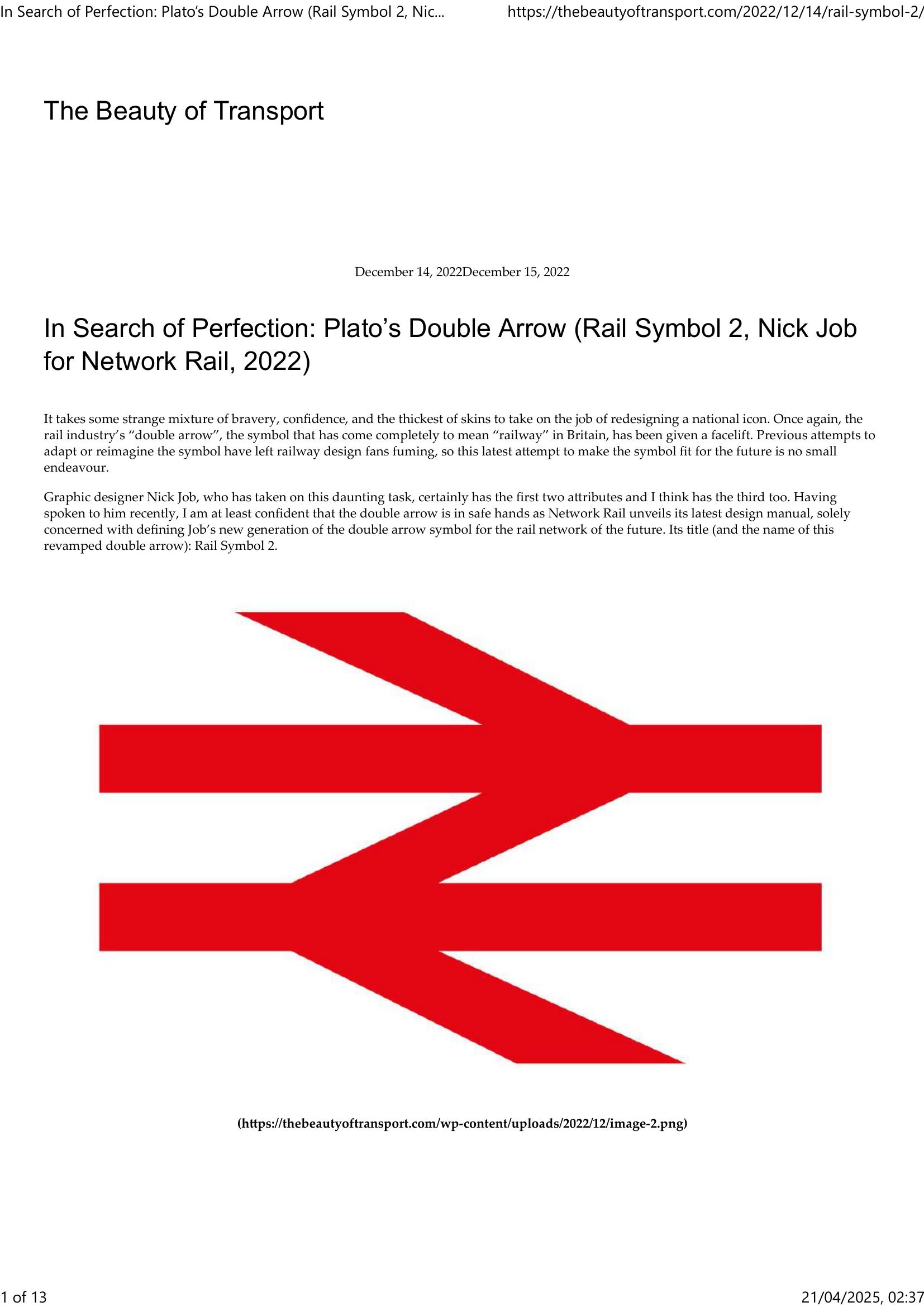
Nick Job has redesigned Britain’s iconic double-arrow rail symbol as Rail Symbol 2, published in Network Rail’s new design manual to restore consistency lost since British Rail’s privatisation. The original 1964 Gerry Barney mark remains widely used but had suffered distortion, incorrect weights and ad hoc reinterpretations (including thickened and multi‑coloured versions). Job, a specialist historian of BR identity, worked with Network Rail and designers to create a version optimised for digital use and easier, more reliable reproduction. Key changes include changing the length:height ratio from 38:23 to 8:5, unifying positive/negative weights into one balanced weight, aligning all three diagonal strokes to the same angle, defining clear unit-based proportions (central section 20 units, outer arms 10 units), and retaining flared arm ends to correct optical illusions. The manual also prescribes correct applications (lozenge for freestanding signs, rules for 3D and flag use) and shows incorrect usages, aiming to preserve the symbol’s elegance while making it future-proof and consistently deployable across the rail network.
Additional information
| Pages | 13 |
|---|---|
| Filesize | 1.1Mb |
Related products
-

Association of Train Operating Companies Information Development Group – GOOD PRACTICE GUIDES FOR CUSTOMER INFORMATION 2013
£0.00 Add to basket -

Association of Train Operating Companies Passenger Information Strategy Group – GOOD PRACTICE GUIDES FOR PROVIDING INFORMATION TO PASSENGERS 2008
£0.00 Add to basket -
Allsop – DETERMINING WHICH REQUIREMENTS OF PUBLIC TRANSPORT USERS IN LARGE CITIES COULD BE MET BY MODERN INFORMATION TECHNOLOGY 1987
£0.00 Add to basket -
Accent Marketing & Research – BUS STATION INFORMATION 1998
£0.00 Add to basket