

Lo – EASY AS A TO B – DESIGNING THE PERFECT TRANSIT MAP – 2014
£0.00
A downloadable PDF file for your personal use.
Description
The document examines transit map design, highlighting the need to balance aesthetic clarity with geographic accuracy and technological integration. Effective maps simplify complex networks, build user confidence, and encourage transit use, while poor designs mislead and confuse. Common mistakes include exporting raw GIS maps, overcrowding central areas, oversimplifying without sound principles, and rigid adherence to 45-degree diagrams. Global styles vary: European maps tend to be clean and diagrammatic, German systems maintain consistent visual language, and US maps range from geographically faithful (e.g., New York) to inconsistent. Geographical maps work well for buses by conveying spatial relationships, whereas rail maps often favor schematic layouts. Digital technology enables real-time updates, zoom-based detail, adaptive displays, and interactive kiosks, though many apps merely replicate paper maps. Attractive, legible maps positively affect perception and ridership. The Stuttgart 2000 map exemplifies isometric, well-labeled design. Future directions include frequency maps, adaptive features, and richer real-time data integration.
Additional information
| Pages | 6 |
|---|---|
| Filesize | 3.2.Mb |
Related products
-
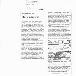
Anon – ONLY CONNECT 1987
£0.00 Add to basket -
American Public Transit Association – TRANSIT MAPS 1984
£0.00 Add to basket -

Association of Train Operating Companies Passenger Information Strategy Group – GOOD PRACTICE GUIDES FOR PROVIDING INFORMATION TO PASSENGERS 2008
£0.00 Add to basket -
Allsop – DETERMINING WHICH REQUIREMENTS OF PUBLIC TRANSPORT USERS IN LARGE CITIES COULD BE MET BY MODERN INFORMATION TECHNOLOGY 1987
£0.00 Add to basket