
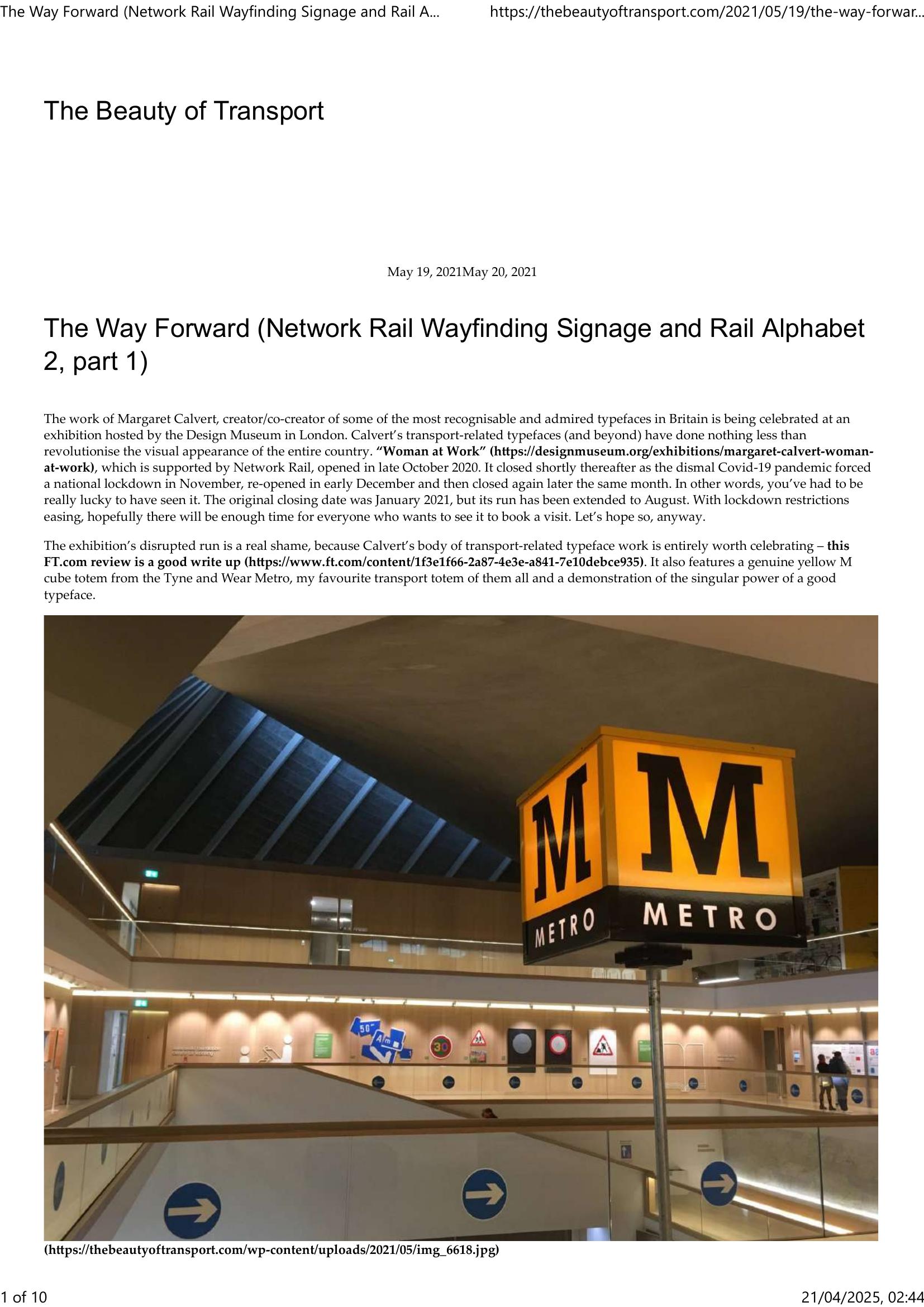
Wright – THE BEAUTY OF TRANSPORT – THE WAY FORWARD 2022
£0.00
A downloadable PDF file for your personal use.
Description
The Design Museum’s “Woman at Work” exhibition celebrates Margaret Calvert’s transport typeface legacy and served as the launch for Rail Alphabet 2 and Network Rail’s new wayfinding manual. The show’s run was repeatedly disrupted by COVID-19, but highlights Calvert’s enduring influence and a Tyne and Wear Metro totem. Network Rail’s signage overhaul, driven by Anthony Dewar, began after concerns that existing Railtrack-era blue signage (set in Brunel) was dated, cluttered and hard to read. Weston Williamson and Spaceagency audited stations, benchmarked international best practice, and ran colour and sightline studies. They proposed separating wayfinding, retail and advertising; using progressive disclosure; and grouping destinations by direction. Three design options were tested: Option 1 (refined blue, Akkurat), Option 2 (minimal white, New Rail Alphabet) and Option 3 (playful “Meandering Tracks,” New Transport). Option 2 won, prompting a substantial visual shift for major stations. Part two will detail Calvert and Henrik Kubel’s role in creating Rail Alphabet 2 and implementing the new standards.
Additional information
| Pages | 10 |
|---|---|
| Filesize | 0.7Mb |
Related products
-
Association of Train Operating Companies – PASSENGER INFORMATION DURING DISRUPTION 2014
£0.00 Add to basket -
Anon – PICTURE THE TRANSIT SYSTEM EFFECTIVELY WITH A ROUTE MAP 1970
£0.00 Add to basket -
Allard – THE DESIGN OF PUBLIC TRANSPORT MAPS 2009
£0.00 Add to basket -

American Public Transit Association – TIMETABLES 1982
£0.00 Add to basket