
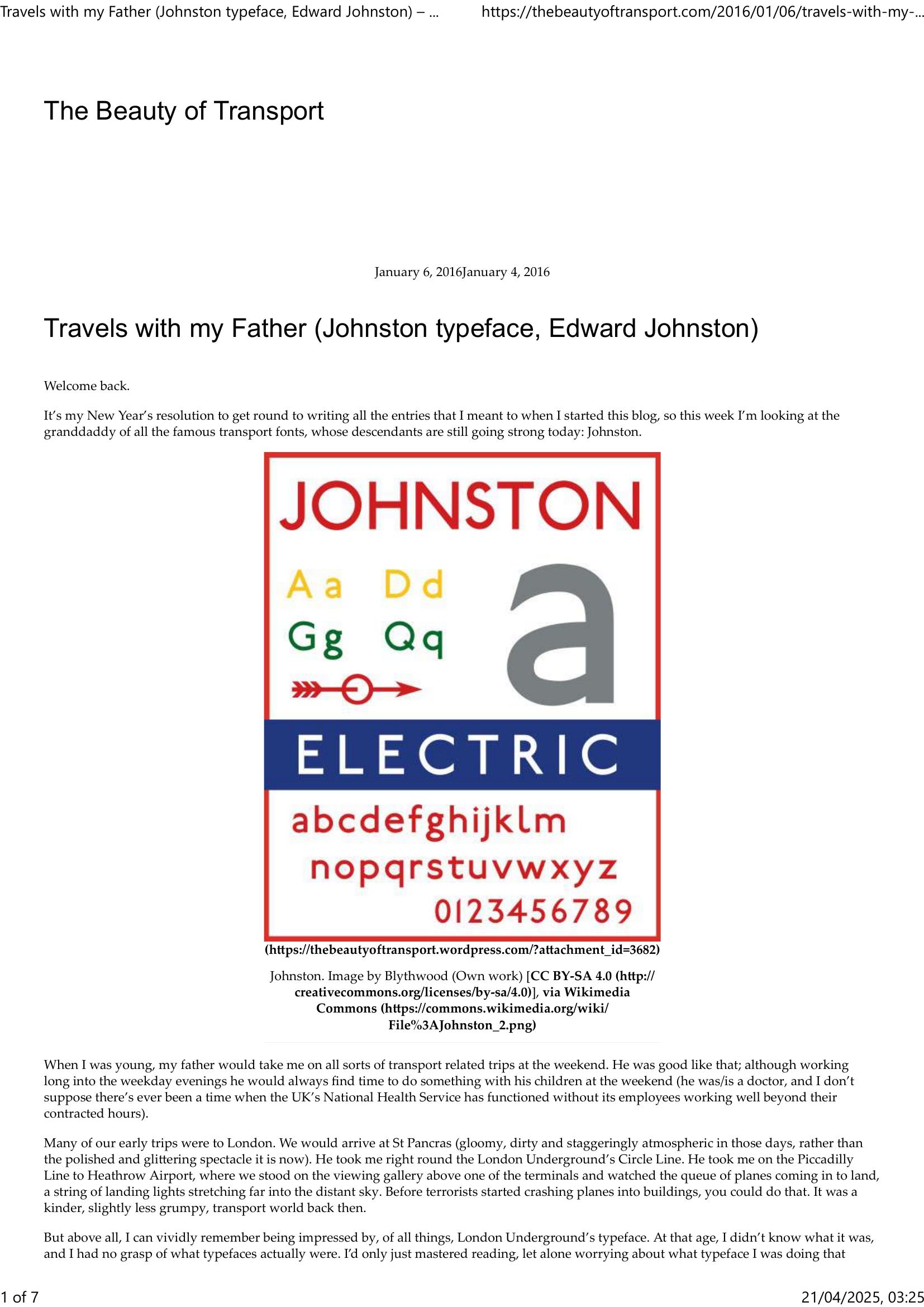
Wright – THE BEAUTY OF TRANSPORT – TRAVELS WITH MY FATHER 2016
£0.00
A downloadable PDF file for your personal use.
Description
The author recalls childhood trips with his father and a youthful fascination with the London Underground’s typeface, Johnston, designed by Edward Johnston for Frank Pick’s transport rebrand. Created between 1915–1916, Johnston is a geometric sans-serif noted for diamond dots on i and j, square- and circle-based letters, and distinctive quirks—features that made it clear, authoritative, and central to London’s visual identity, including the canonical Underground roundel. Retained as London Transport’s corporate face from 1933, Johnston influenced later designs such as Gill Sans and Rail Alphabet. Decline in usage mid-century led Eiichi Kono to modernize the family into New Johnston with expanded weights and styles; the author prefers some original traits and finds certain New Johnston applications less appealing. Restricted largely to transport until its broader release in 1997, Johnston has since appeared beyond the Underground—on trains, buses, and even BBC’s Sherlock—yet remains most closely associated with London’s transport heritage and the author’s personal memories.
Additional information
| Pages | 7 |
|---|---|
| Filesize | 0.4Mb |
Related products
-
Anon – ONLY CONNECT 1987
£0.00 Add to basket -
Allsop – DETERMINING WHICH REQUIREMENTS OF PUBLIC TRANSPORT USERS IN LARGE CITIES COULD BE MET BY MODERN INFORMATION TECHNOLOGY 1987
£0.00 Add to basket -

Association of Transport Co-ordinating Officers – PRINTED PUBLIC TRANSPORT INFORMATION 2003
£0.00 Add to basket -

Association of Train Operating Companies Information Development Group – GOOD PRACTICE GUIDES FOR CUSTOMER INFORMATION 2013
£0.00 Add to basket